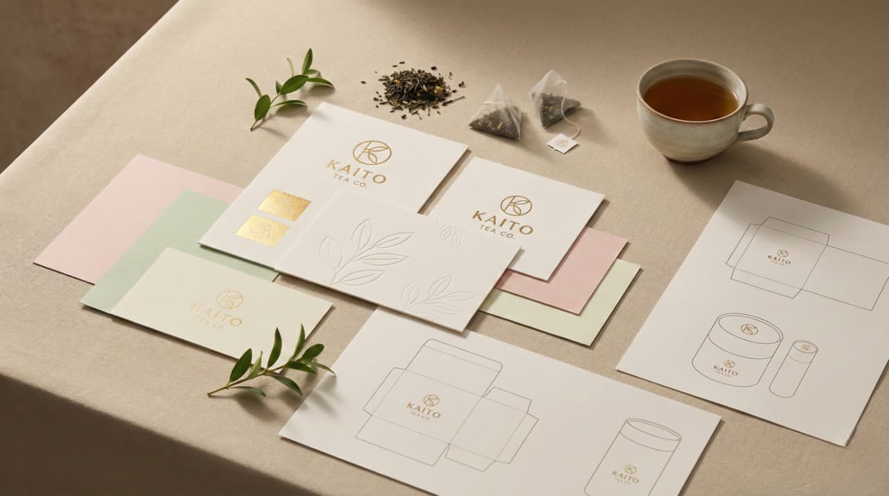
Kaito Tea Co.
Kaito Tea Co. needed a brand identity that felt both modern and rooted in tradition. We developed a visual system inspired by the calm, intentional rituals of tea culture. The result is a brand that feels authentic, warm, and distinctly crafted.
Project Type
brand identity

The identity centered around a clean typographic structure paired with soft organic forms. We explored color palettes that echoed natural tea tones and packaging textures that invited touch. Every element was created to reflect the quiet confidence of the brand.


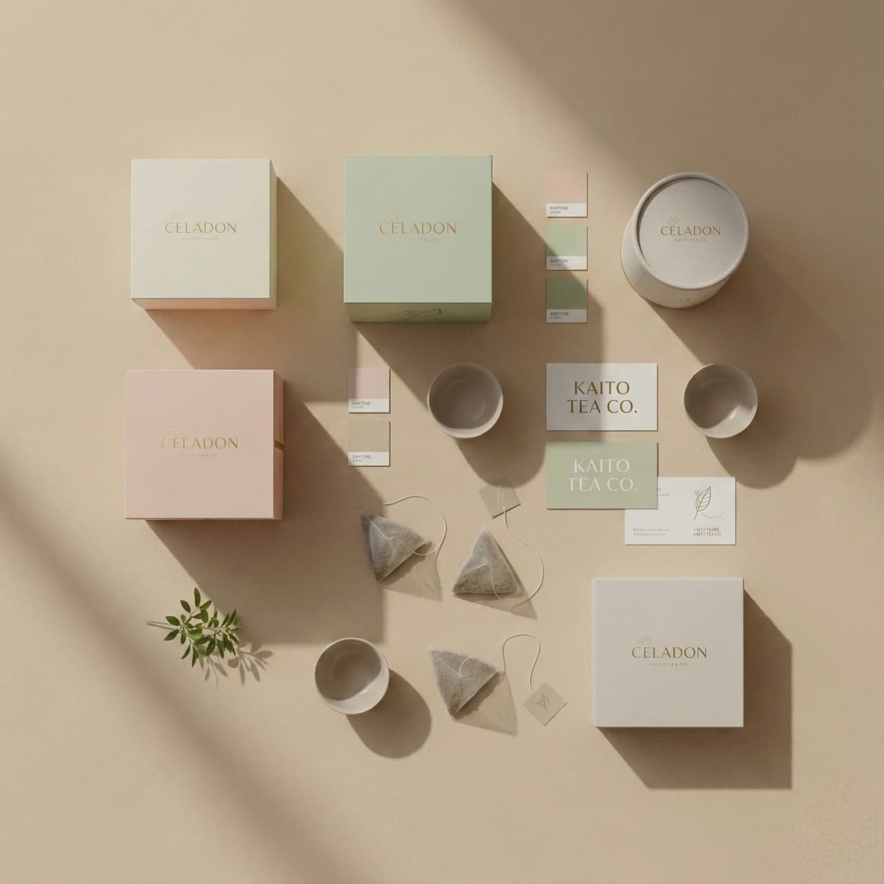


Kaito Tea Co.
Kaito Tea Co. needed a brand identity that felt both modern and rooted in tradition. We developed a visual system inspired by the calm, intentional rituals of tea culture. The result is a brand that feels authentic, warm, and distinctly crafted.
Project Type
brand identity
The identity centered around a clean typographic structure paired with soft organic forms. We explored color palettes that echoed natural tea tones and packaging textures that invited touch. Every element was created to reflect the quiet confidence of the brand.
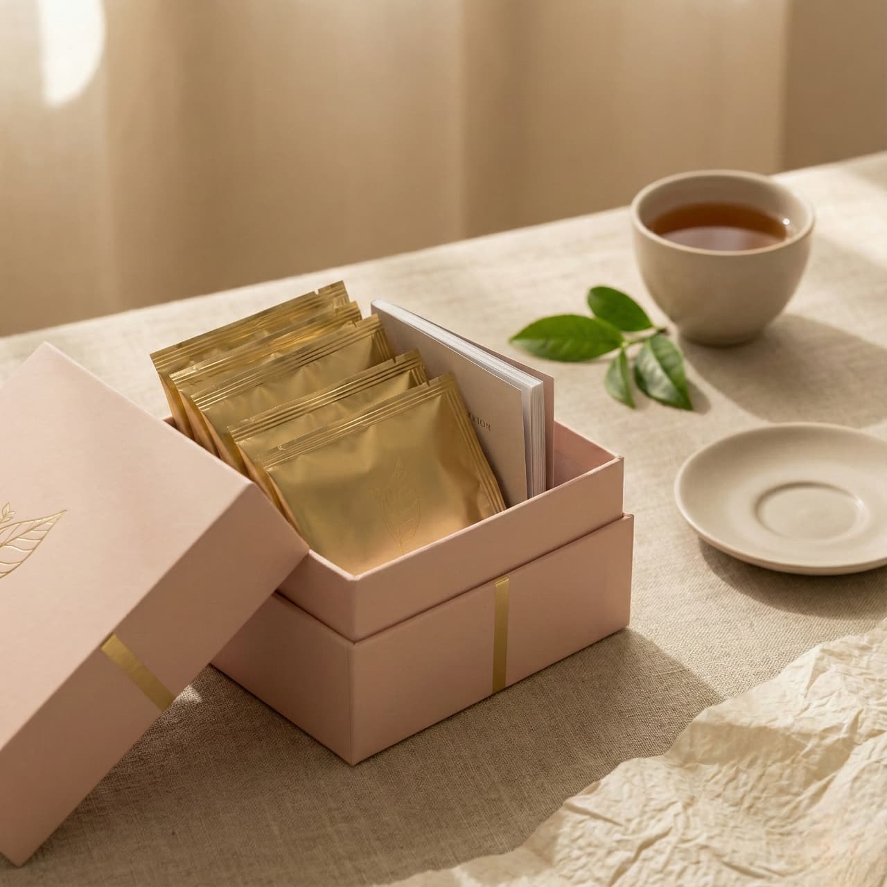